Free · hands-on · no sign-in
Accessibility, practiced.
Free accessibility labs and WCAG tests
Free hands-on labs and field notes for anyone who makes or reads digital content. Test a focus ring on twelve backgrounds. Write alt text for the same photo in five contexts. Find out whether your terminal theme is readable at 2 am.
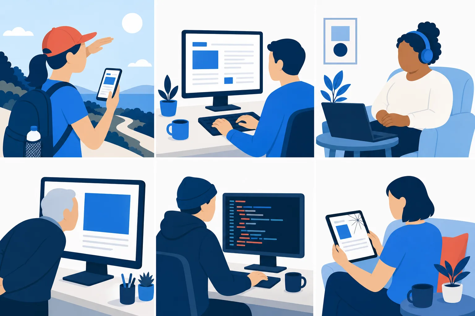
Why this matters
Accessibility is not a checklist you pass once. It is a way of noticing who is on the other end of what you make.
-
Everyone is a reader
Every person who opens a page, a document, a chat window, or a terminal is consuming digital content. At some point, each of them will read it with tired eyes, a cracked screen, bright sunlight, a keyboard only, a screen reader, or a browser zoomed to 300 percent. Accessibility is the name for content that still works at that moment.
-
Every maker ships to someone they will never meet
The person on the other end of your focus ring, your image, or your color palette is not in the room. Accessibility is the discipline of designing for the person you did not picture.
-
The work lives in the details
Checklists tell you what to avoid. They rarely show you what great looks like. A great focus state, an alt text that carries the meaning, a terminal theme you can read late at night: these are craft decisions, and craft is learned by doing.
What you will find here
-
Labs
Try it yourself
Interactive exercises you complete in the browser: design a focus ring, write alt text in context, build a palette that passes every pair, measure buttons against the 24 px rule, walk a page with Tab, finish a form without a mouse.
Open the labs -
Field Notes
The details other guides skip
Short, specific articles on the parts of accessibility that are hard to find written down. Every note ends in a lab or a live example.
Read the notes -
Gallery
What great looks like
Curated focus states, alt text that worked, and contrast-verified palettes, each with the source and the reasoning. Submissions welcome.
Browse the gallery -
For Agents
Guidance machines can follow
How an accessibility agent or code assistant should decide on alt text, check a focus state, and verify its own output. Human-readable and machine-readable.
Read the agent guidance
Latest field notes
-
Twenty-four pixels is a smaller promise than it sounds
WCAG 2.2 asks for pointer targets of 24 by 24 CSS pixels. The spacing exception means a row of 18 px icons can pass and a row of 24 px icons can be hard to hit. Here is the rule, the circle, and the five exceptions, drawn.
-
When the toolbar will not fit
Five icons, a narrow bar, and a 24 px rule that cannot be met as laid out. Adding height does not fix it. Wrapping does. An equal split of the width can leave every icon one pixel short. Here is the order to try fixes in, and when to stop.
-
Tab order is a promise the DOM makes
The Tab key follows the HTML, not the layout. CSS cannot change that order, a positive tabindex hijacks it, and aria-hidden does not remove a stop. One real walk found 162 stops where a list of the markup said 64. Here is why, and how to check.
Have a focus state worth showing off?
Send a focus ring, an alt text that worked, or a palette you are proud of. The best ones go in the gallery with credit.
Submit to the gallery