Hover is a state most people do not have
Touch, keyboard, switch, and voice never hover. A menu, tooltip, or button that appears only on hover does not exist for them.
Open almost any dashboard. Move the mouse over a row and a set of buttons fades in: edit, duplicate, delete. Move away and they vanish. It looks clean. It is also a trap, because hover is a state that only a mouse or a trackpad can produce.
Who never hovers
Touch. A finger on a phone or tablet has no hover. Tapping is a click. Some browsers fake a hover on the first tap, which means the first tap opens the menu and the second tap does the thing, and nobody knows which tap they are on.
Keyboard. Tab moves focus. Focus is not hover. The row's buttons stay invisible while focus moves through them one by one, so a keyboard user tabs through three controls they cannot see and activates one by accident.
Switch and voice. A switch user moves focus with one or two buttons. A voice user says "click delete," and the software looks for a visible control named delete. If it is hidden until hover, it is not there to be found.
Screen magnification. At 400 percent zoom, a hover menu often opens off screen, and moving the mouse to find it closes it.
Here is the full picture as a grid.
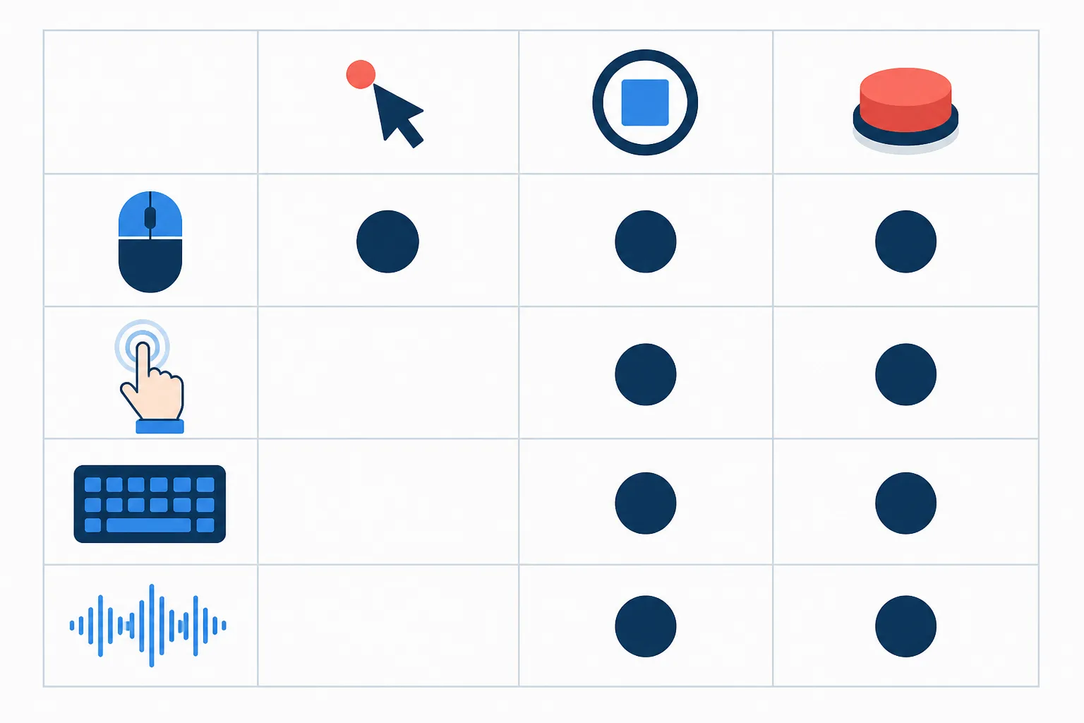
| Input | Hover | Focus | Active |
|---|---|---|---|
| Mouse | Yes | Yes | Yes |
| Touch | No | Yes | Yes |
| Keyboard | No | Yes | Yes |
| Switch | No | Yes | Yes |
| Voice control | No | Yes | Yes |
One row can hover. Every row can focus. Design for the column everyone has.
The fix is one selector
Wherever you wrote :hover, write :focus-within beside it.
/* Before: mouse only */
.row .actions { opacity: 0; }
.row:hover .actions { opacity: 1; }

/* After: mouse, keyboard, switch */
.row:hover .actions,
.row:focus-within .actions { opacity: 1; }
:focus-within matches the row whenever anything inside it has focus. Tab into the first hidden button and the whole set appears. That handles keyboard and switch.
Touch still needs more, because a finger never focuses a row without activating something. Two options: show the actions always on narrow screens, where there is no mouse anyway, or put them behind a visible button. A small "Actions" button that opens the set is boring, and it works for everyone.
@media (hover: none) {
  .row .actions { opacity: 1; }
}
The hover: none media query is true on devices whose primary input cannot hover. It is a reasonable default for showing the controls outright.
Tooltips and titles
The title attribute is a hover-only tooltip in most browsers. It never appears on touch and is unreliable with screen readers. Anything in a title that a reader needs should also be visible text, an aria-label, or a real tooltip that opens on focus.
Menus
A dropdown that opens on hover and closes on mouse-out is the classic case. Make the trigger a real button with aria-expanded, open it on click, and let :focus-within keep it open while focus is inside. Mouse users lose nothing. Everyone else gains a menu.
A quick test
Unplug the mouse, or just put your hands on the keyboard and press Tab through the page. Anything you could not see, you could not find. The corpus page 07-hover-only is a small example of both failures if you want to practice spotting them.